
Color schemes play a crucial role in home remodeling, particularly when it comes to selecting paint colors. The right color palette can transform the ambiance of a space, creating a harmonious and visually appealing environment. Whether renovating an entire house or redoing a single room, careful consideration must be given to the selection of paint colors in order to achieve desired aesthetic outcomes. For instance, imagine a hypothetical scenario where a homeowner desires to create a cozy and inviting living room. By choosing warm earth tones such as beige, brown, and terracotta for the walls, they can achieve a welcoming atmosphere that encourages relaxation and socialization.
In addition to enhancing aesthetics, color schemes also influence emotions and perceptions within interior spaces. Various studies have demonstrated that different hues elicit distinct psychological responses from individuals occupying those spaces. This knowledge can be leveraged by homeowners during remodeling projects to curate specific moods or cater to particular functions within rooms. For example, cool blues and greens are known to promote calmness and tranquility, making them ideal choices for bedrooms or meditation areas. On the other hand, vibrant yellows and oranges exude energy and enthusiasm, which may be more suitable for stimulating creativity in home offices or art studios. Therefore, understanding the impact of color psychology is crucial in creating an environment that aligns with the desired emotional and functional goals of each room.
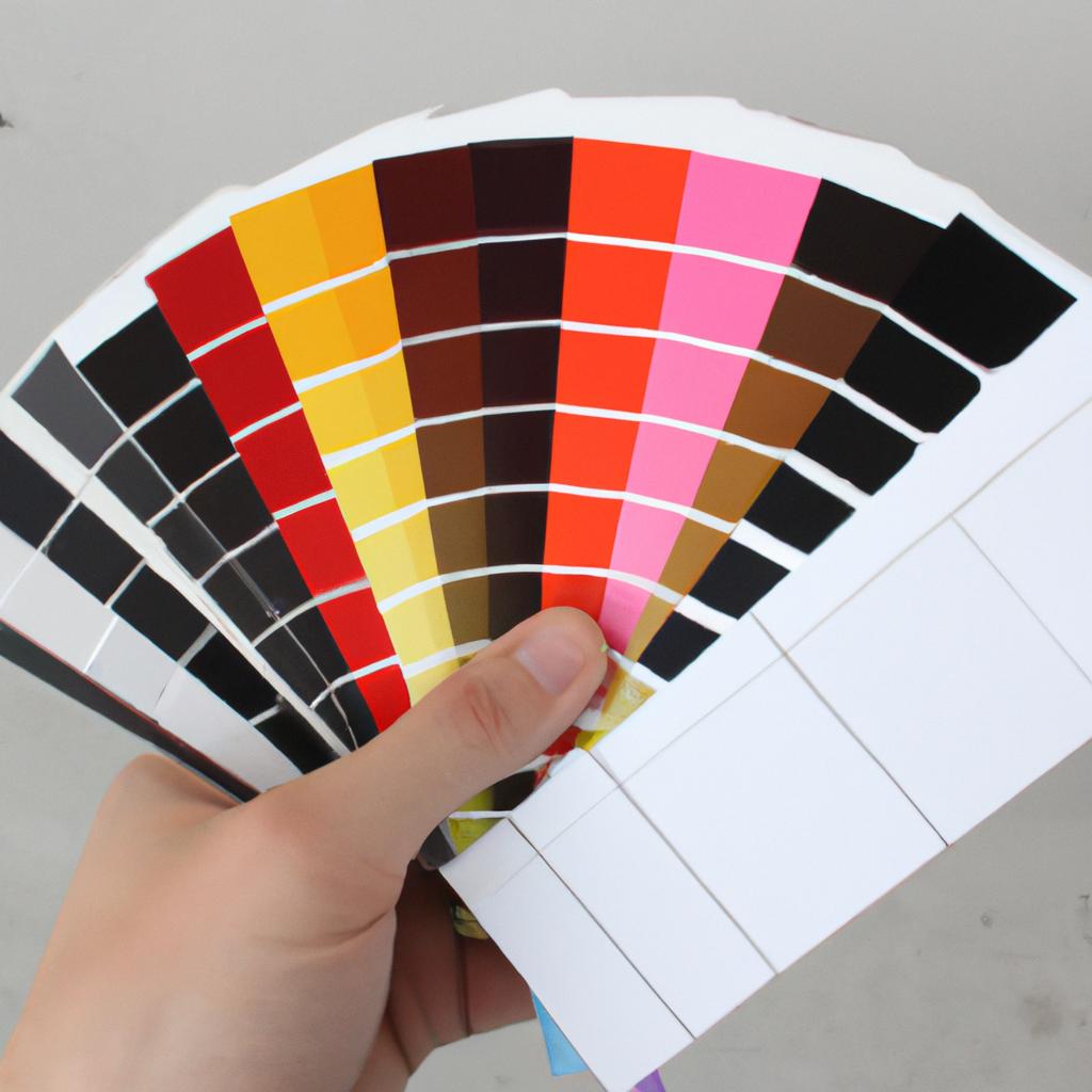
Choosing the Right Color Scheme for Your Home
Imagine walking into a beautifully remodeled home, where every room exudes a sense of harmony and balance. The secret behind such stunning transformations lies in choosing the right color scheme. By strategically selecting paint colors that complement each other and reflect your personal style, you can create a cohesive and inviting space.
One example that illustrates the power of color schemes is a living room makeover project. In this case, the homeowner wanted to transform their outdated space into a modern oasis. After careful consideration, they opted for a monochromatic color scheme with varying shades of blue-gray. By using different tones from light to dark on walls, furniture, and accessories, they were able to achieve an elegant yet calming atmosphere.
To help you understand how color schemes can evoke specific emotions and set the mood in your home, here are some key points:
- Warm Colors: Shades like reds, oranges, and yellows promote energy and excitement. They are perfect choices for spaces where socializing or entertaining takes place.
- Cool Colors: Blues, greens, and purples have a soothing effect on our minds. These hues work well in areas intended for relaxation or concentration.
- Neutral Colors: Whites, grays, beiges, and browns provide a timeless backdrop that allows other elements in your home to shine.
- Complementary Colors: Pairing colors opposite each other on the color wheel creates visual interest and adds vibrancy to any room.
In addition to these bullet points about color psychology, it’s important to consider how various colors interact with one another within your chosen scheme. To further illustrate this point visually:
| Primary Color | Secondary Color | Tertiary Color |
|---|---|---|
| Blue | Orange | Green |
| Red | Purple | Yellow |
| Yellow | Violet | Orange |
| Green | Blue | Indigo |
Understanding the interplay between colors and their emotional impact is crucial when selecting a color scheme for your home. By carefully considering the emotions you want to evoke in each space, you can make informed decisions that will enhance your living environment.
Transitioning into the subsequent section on “Understanding Color Psychology in Home Design,” let’s delve deeper into how different colors affect our mood and perception of spaces.
Understanding Color Psychology in Home Design
Color plays a significant role in our lives, influencing our emotions and perceptions. In the realm of home design, understanding color psychology can help you create a space that evokes the desired mood and atmosphere. Let’s take a closer look at how different colors can impact your home and its inhabitants.
Imagine walking into a living room adorned with shades of blue. The calmness it exudes instantly relaxes your mind after a long day. This example highlights the power of color to influence our emotional state. By choosing the right color scheme for your home, you can create an environment that promotes tranquility or invigorates energy, depending on your preference.
To further explore the impact of colors on our emotions, consider the following bullet points:
-
Warm Colors:
- Red: Evokes passion and energy.
- Orange: Promotes warmth and enthusiasm.
- Yellow: Creates feelings of happiness and positivity.
-
Cool Colors:
- Green: Symbolizes nature and induces relaxation.
- Blue: Instills serenity and aids concentration.
- Purple: Represents luxury and creativity.
-
Neutral Colors:
- Beige: Exudes simplicity and elegance.
- Gray: Provides versatility and balance.
- Brown: Conveys comfort and stability.
| Color | Emotion | Example |
|---|---|---|
| Red | Passionate | A vibrant red accent wall |
| Blue | Calm | Light blue bedding |
| Green | Refreshing | Potted plants in the corner |
| Yellow | Cheerful | Sunflower-inspired accessories |
By carefully selecting a color palette based on their psychological effects, homeowners can transform their spaces into havens that elicit specific emotions. Whether you desire a cozy, warm atmosphere or an invigorating and lively ambiance, color is a powerful tool that can help you achieve your desired outcome.
Transitioning into the subsequent section on “Exploring Neutral Color Schemes for a Modern Look,” we will further explore how neutral colors can be used effectively in home design to create a contemporary aesthetic without sacrificing warmth or style.
Exploring Neutral Color Schemes for a Modern Look
Creating a Welcoming Ambiance with Warm Color Palettes
Imagine stepping into a cozy living room adorned with warm hues of reds, oranges, and yellows. The colors immediately envelop you in a sense of comfort and warmth, creating an inviting atmosphere for relaxation and socializing. When it comes to home remodeling, choosing the right color scheme is crucial in setting the desired mood and ambiance. In this section, we will explore how warm color palettes can transform your space and create a welcoming environment.
A well-chosen warm color palette can evoke feelings of coziness, energy, and intimacy within your home. Here are some key characteristics of warm colors:
- Energizing: Colors like vibrant red or fiery orange have the ability to infuse a space with energy and excitement. They stimulate conversation and interaction among occupants.
- Comforting: Shades such as soft yellows or earthy browns emit a comforting aura that promotes relaxation and contentment.
- Intimate: Deep tones like burgundy or terracotta create an intimate atmosphere perfect for spaces meant for unwinding after a long day.
To better understand how different warm colors work together in creating various moods, let’s take a look at the following table:
| Color | Mood |
|---|---|
| Red | Passionate |
| Orange | Energetic |
| Yellow | Cheerful |
By carefully selecting combinations from this palette, you can achieve different effects based on your desired outcome. For instance, pairing passionate red with cheerful yellow can result in an energetic yet lively ambiance suitable for entertainment areas.
Incorporating warm color schemes throughout your home remodeling project allows you to personalize each room according to its function while maintaining a cohesive overall design. Creating a calming atmosphere with cool color palettes will be our next focus as we delve into ways to bring tranquility into your living spaces without compromising style or sophistication.
Creating a Calming Atmosphere with Cool Color Palettes
Neutral color schemes can be an excellent choice when remodeling your home, as they provide a modern and sophisticated look that is both versatile and timeless. By using neutral colors, you create a blank canvas for other design elements to shine while still maintaining visual interest. Let’s consider the case of a hypothetical living room remodel to better understand the impact of neutral color schemes.
Imagine transforming a dull and outdated living room into a stylish space by incorporating neutral colors. The walls could be painted in a warm shade of beige, creating a cozy atmosphere while allowing flexibility in furniture choices. To add depth and texture, accent pieces like throw pillows or curtains in shades of cream or gray could be introduced. This combination creates an elegant yet understated aesthetic.
To further illustrate the benefits of neutral color schemes, let’s explore some key reasons why they are popular among homeowners:
- Versatility: Neutral colors serve as a backdrop that complements various styles and allows for easy incorporation of different textures and patterns.
- Timelessness: Unlike trendy colors that may become dated quickly, neutrals have long-lasting appeal.
- Visual Expansion: Lighter shades within neutral palettes can visually enlarge smaller spaces.
- Calming Effect: Neutrals evoke tranquility and can promote relaxation in rooms such as bedrooms or study areas.
Moreover, considering how different hues interact within a neutral color scheme is crucial. Take inspiration from the following table showcasing four combinations commonly used in interior design:
| Color Combination | Description |
|---|---|
| Beige + Cream | A classic pairing with warmth |
| Gray + White | Creates an airy and minimalist feel |
| Taupe + Charcoal | Adds sophistication |
| Ivory + Brown | Elicits elegance |
By understanding the emotional response evoked by these combinations, you can make informed decisions about which ones align with your desired aesthetic and the mood you wish to create in your living space.
Transitioning into our next section, let’s now explore how earth tone color schemes can infuse warmth and depth into your home, creating a cozy ambiance that promotes relaxation.
Adding Warmth and Depth with Earth Tone Color Schemes
With the aim of achieving a serene and tranquil ambiance in your home, incorporating cool color palettes can be an effective approach. By utilizing colors found on the cooler side of the color wheel, such as blues, greens, and violets, you can create a space that promotes relaxation and tranquility. An example to illustrate this concept is transforming a small bedroom into a peaceful retreat by using soft shades of blue and green.
Paragraph 1:
When selecting paint colors for your home remodel, it’s important to consider the psychological effects they may have on individuals. Cool colors are known for their ability to evoke feelings of calmness and serenity, making them ideal choices for spaces where rest and relaxation are desired. These hues have been associated with lowering blood pressure and reducing stress levels. Incorporating cool colors in bedrooms or living rooms can help create an environment conducive to unwinding after a long day.
To further enhance the calming effect of cool color palettes, here are some key considerations:
- Choose light shades: Lighter tones tend to amplify the soothing nature of cool colors.
- Opt for monochromatic schemes: Utilizing different shades within the same color family creates visual harmony.
- Balance with warm neutrals: Introducing warm neutral accents through furniture or accessories adds depth and balance to cool color schemes.
- Experiment with textures: Combining smooth surfaces with textured elements like natural fibers or rough finishes provides visual interest while maintaining a sense of tranquility.
Paragraph 2:
To illustrate how these principles can be applied practically, let’s explore an example case study. Imagine transforming a small master bedroom into a serene oasis using cool color palettes. The walls could be painted in a pale shade of blue-gray, creating a gentle backdrop that promotes relaxation. Adding touches of seafoam green through accent pillows or curtains brings forth subtle pops of color, while maintaining the overall calm atmosphere. By incorporating light-colored furniture and textured elements such as a woven area rug or linen bedding, the room becomes an inviting sanctuary for rest.
| Key Considerations |
|---|
| Choose light shades |
| Opt for monochromatic schemes |
| Balance with warm neutrals |
| Experiment with textures |
Paragraph 3:
By thoughtfully selecting cool color palettes and implementing these key considerations in your home remodel, you can create an environment that fosters tranquility and relaxation.
Continuing our exploration of color schemes, let’s now delve into the exciting realm of incorporating bold and vibrant colors for a personalized touch.
Incorporating Bold and Vibrant Colors for a Pop of Personality
In the realm of home remodeling, color choices play a significant role in creating a desired ambiance. While earth tones bring warmth and depth to a space, bold and vibrant colors provide a pop of personality. However, there is another approach that can transform your home into an oasis of serenity and calmness. By incorporating serene and calming color palettes, you can create an atmosphere that promotes relaxation and tranquility.
Imagine walking into a living room where soft hues of blue are paired with gentle shades of green. The subtle combination instantly transports you to a tranquil coastal retreat, evoking feelings of peace and serenity. This example showcases the power of color schemes in setting the mood for any space within your home.
To achieve this effect, consider the following key elements:
-
Color Palette Choices:
- Soft blues: These cool-toned shades promote a sense of calmness.
- Muted greens: Earthy greens instill harmony and balance.
- Pale grays: Light gray tones add sophistication without overwhelming the space.
- Off-white or cream accents: These neutral tones complement the overall palette while providing a touch of warmth.
-
Furniture Selection:
- Opt for furniture pieces in natural materials such as wood or rattan to enhance the organic feel.
- Choose upholstery fabrics in complementary colors like beige or light brown to maintain visual coherence.
-
Lighting Considerations:
- Incorporate warm lighting fixtures with dimmer switches to create a soothing ambience during evenings.
- Utilize sheer curtains or blinds that allow sunlight to gently filter through, enhancing the airy atmosphere.
-
Decorative Elements:
- Introduce nature-inspired artwork or photographs depicting landscapes to reinforce the peaceful theme.
- Use textures like linen or cotton for pillows, throws, and rugs to further enhance comfort.
By incorporating these aspects into your design plan with a serene and calming color palette, you can transform any room in your home into a sanctuary that promotes relaxation and tranquility. Embrace the power of colors to create an environment where stress melts away, allowing you to fully enjoy the comfort of your own space.
Remember, when selecting colors for your home remodeling project, it is essential to consider not only personal preferences but also the atmosphere you wish to create.
Comments are closed.