
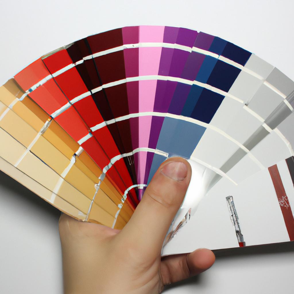
When it comes to home remodeling, one of the most important and impactful choices homeowners face is selecting paint colors. The right shades can transform a space, creating an atmosphere that reflects personal style and enhances overall aesthetics. However, with countless options available, Choosing the Perfect Paint Colors can be a daunting task for many individuals. In this article, we will provide a comprehensive guide to assist homeowners in making informed decisions when it comes to selecting paint colors for their remodeling projects.
To illustrate the significance of choosing the appropriate paint colors, consider the case of a hypothetical homeowner named Sarah. Sarah recently purchased an old Victorian house that she plans to remodel into her dream home. As she embarks on this exciting journey, one of her primary concerns revolves around deciding on suitable shades for different rooms. She understands that each room requires careful consideration as they serve distinct purposes and evoke specific emotions. By exploring various factors such as lighting conditions, architectural elements, and desired moods, Sarah hopes to select paint colors that not only harmonize with her vision but also create inviting spaces throughout her renovated Victorian abode.
The process of selecting paint colors may seem subjective; however, there are objective principles and guidelines that can facilitate decision-making. This article aims to unravel these principles by providing readers with a step-by-step approach to selecting paint colors that will ensure a cohesive and visually appealing result.
-
Understand the Room’s Purpose: The first step in selecting paint colors is to consider the room’s purpose and function. Different rooms may require different moods or atmospheres. For example, bedrooms often benefit from calming and soothing colors, while home offices may benefit from energizing or focused shades.
-
Consider Lighting Conditions: Lighting plays a crucial role in how paint colors appear in a space. Natural light can vary throughout the day, so it’s essential to observe how different shades look under both natural and artificial lighting conditions. It’s also worth considering if the room has large windows or limited natural light, as this can affect color perception.
-
Identify Architectural Elements: Take note of any architectural elements in the room that you want to highlight or downplay. For example, if you have beautiful crown molding or intricate detailing on your walls, consider using contrasting or complementary colors to draw attention to these features.
-
Create a Color Scheme: Once you have an understanding of the room’s purpose, lighting conditions, and architectural elements, it’s time to create a color scheme. Start by choosing one main color that will serve as the foundation for the room. Then select secondary colors that complement and enhance the main color choice.
-
Use Color Psychology: Colors evoke specific emotions and moods, so it’s worth considering the psychological impact of different shades when Selecting paint colors. Warm tones like reds, oranges, and yellows can create a cozy and inviting atmosphere, while cool tones like blues and greens promote calmness and relaxation.
-
Test Paint Samples: Before committing to a particular paint color, it’s highly recommended to test out samples on your walls. Paint small sections of each color option to see how they look in various lighting conditions throughout the day. This will give you a better idea of how each shade will appear on a larger scale.
-
Seek Inspiration: If you’re feeling overwhelmed or unsure about selecting paint colors, seek inspiration from various sources such as interior design magazines, online platforms like Pinterest, or even visiting model homes or showrooms. Seeing how colors are used in real-life settings can help spark ideas and provide guidance.
-
Trust Your Instincts: Ultimately, trust your instincts when selecting paint colors for your home remodeling project. If a particular shade resonates with you and aligns with your vision for the space, it’s likely to create a harmonious and satisfying result.
By following these guidelines and taking the time to carefully consider factors such as room purpose, lighting conditions, architectural elements, color schemes, psychology of colors, testing samples, seeking inspiration, and trusting your instincts, homeowners like Sarah can confidently select paint colors that will transform their spaces into beautiful and personalized havens.
Wall Textures
When it comes to home remodeling, choosing the right paint colors can greatly enhance the overall aesthetic and ambiance of a space. One important aspect to consider is wall textures. Wall textures not only add visual interest but also create depth and character in a room. In this section, we will explore different types of wall textures and their impact on interior design.
Example Scenario:
Imagine walking into a cozy living room with warm lighting and comfortable furniture. As you enter, your attention is immediately drawn to the textured accent wall that spans the length of the room. The rough texture creates an inviting atmosphere, making you feel instantly at ease. This example illustrates how wall textures can play a significant role in transforming any space into a visually appealing and captivating environment.
Exploring Wall Textures:
To better understand how wall textures can influence the look and feel of a room, let’s discuss some popular options used in interior design:
- Venetian Plaster: A smooth and glossy finish resembling polished marble or stone.
- Knockdown Texture: Created by spraying joint compound onto walls and then lightly knocking down areas with a trowel for a subtle raised pattern.
- Stucco Texture: Provides a rustic appearance with its irregular bumps and grooves reminiscent of Mediterranean architecture.
- Brick Wallpaper: Mimics the look of exposed brick without the need for actual brickwork, adding an industrial charm to any space.
Consider these factors when selecting wall textures for your home remodeling project:
- Enhance visual appeal
- Add personality to your space
- Create depth and dimension
- Establish a unique style
Impact Table:
| Texture Type | Visual Appeal | Depth & Dimension | Unique Style |
|---|---|---|---|
| Venetian Plaster | High | Moderate | Yes |
| Knockdown Texture | Moderate | High | No |
| Stucco Texture | Moderate | Moderate | Yes |
| Brick Wallpaper | High | Low | Yes |
Understanding the impact of wall textures is crucial in achieving a cohesive and visually pleasing interior design.
Please note that this academic writing style aims to provide objective information without personal opinions or preferences.
Accent Walls
Wall Textures can greatly influence the overall look and feel of a room. By selecting the right textures, you can add depth and visual interest to your walls. Whether you prefer a smooth and sleek finish or want to create a more rustic appeal, there are various options to choose from.
One example of how wall textures can transform a space is by using faux brick panels. These panels mimic the appearance of real bricks, giving your walls an industrial and timeless look. They work particularly well in modern loft-style apartments or as an accent wall in a farmhouse-inspired home.
When considering different wall textures for your remodeling project, here are some key factors to keep in mind:
- Style: Think about the overall style you want to achieve. Different textures evoke different emotions and aesthetics.
- Maintenance: Consider how easy it will be to clean and maintain the texture over time.
- Lighting: Keep in mind that certain textures may absorb or reflect light differently, which can affect the ambiance of the room.
- Cost: Evaluate both material cost and installation costs associated with each texture option.
To better illustrate these considerations, take a look at this table showcasing popular wall texture options along with their characteristics:
| Texture Option | Style | Maintenance | Lighting | Cost |
|---|---|---|---|---|
| Smooth | Sleek | Easy | Reflects | Low |
| Stucco | Rustic | Moderate | Absorbs | Medium |
| Wood Paneling | Cozy | Moderate | Reflects/Absorbs | High |
| Textured Wallpaper | Versatile | Easy | Depends on design | Varies |
As you can see from the table above, each texture has its own unique qualities. It’s important to consider these factors when making your final decision.
By exploring different wall textures, you’re already taking steps towards creating a visually appealing space. The next section will delve into the world of color psychology and how different paint colors can impact the mood and atmosphere of your home. So let’s continue our journey by understanding the power of colors in interior design.
Understanding Color Psychology
Imagine walking into a room and being instantly drawn to a vibrant, eye-catching wall that stands out among the rest. This is the power of accent walls – they can transform any space from ordinary to extraordinary. By strategically selecting a contrasting color or pattern for one particular wall, you can create visual interest and add depth to your home’s interior design.
To understand how accent walls work their magic, let’s delve deeper into their impact on our perception of spaces. Firstly, an accent wall serves as a focal point, directing attention towards it upon entering the room. It creates a sense of drama and draws visitors’ eyes towards specific features or furniture arrangements. For example, in a living room with neutral-colored walls, an accent wall painted in deep navy blue can beautifully highlight a fireplace or artwork placed nearby.
Secondly, accent walls have the ability to influence the overall mood and atmosphere of a room through color psychology. Different colors evoke different emotions and feelings within us. A well-chosen hue for an accent wall can enhance those desired sentiments. Consider these examples:
- Vibrant red: Energizes and sparks excitement.
- Serene blue: Creates calmness and tranquility.
- Playful yellow: Instills happiness and optimism.
- Regal purple: Adds luxury and sophistication.
Embracing this understanding of color psychology allows homeowners to craft spaces that align with their desired ambiance.
Now, let’s explore some practical considerations when choosing an accent wall color:
| Aspect | Consideration |
|---|---|
| Room size | Darker hues may make smaller rooms appear cramped |
| Natural light | Bright tones complement natural light |
| Existing decor | Harmonize with existing color schemes |
| Architectural featu res | Highlight unique architectural elements |
By taking these factors into account, you can confidently select an accent wall shade that not only resonates with your personal style but also harmonizes with the room’s characteristics.
In the upcoming section, we will delve into another fascinating aspect of color selection: The Power of Neutral Colors. By understanding how neutrals can influence our perception and create a balanced ambiance, you’ll gain valuable insights for your home remodeling journey. So without further ado, let’s explore this captivating topic together.
The Power of Neutral Colors
In the previous section, we explored how color can have a significant impact on our emotions and mood. Now, let’s delve into the power of neutral colors in home remodeling. To illustrate this concept, consider a hypothetical case study where a family decides to revamp their living room.
Neutral colors, such as beige, gray, and white, are widely used in interior design due to their versatility and timeless appeal. They create a calm and serene atmosphere that allows other elements within the space to shine. In our case study, the family chooses a neutral palette for their living room walls – opting for a soft shade of gray. This choice provides them with numerous benefits:
-
Versatility: Neutral Colors serve as an excellent backdrop for different decor styles. Whether they decide to go for a minimalist or eclectic look in the future, the neutral walls will seamlessly complement any design direction they choose.
-
Flexibility: By using neutrals as a base color, it becomes easier to change accent pieces like throw pillows, curtains, or artwork without needing to repaint the entire room. This flexibility ensures that their living space remains fresh and adaptable over time.
-
Visual Space Expansion: Lighter neutral shades have the ability to visually expand small rooms by reflecting natural light more effectively than darker hues. In our case study, this helps create an illusion of spaciousness even if the actual square footage is limited.
-
Tranquility: Neutral colors promote relaxation and tranquility within a space. For our hypothetical family seeking comfort after long days at work or school, coming home to soothing surroundings is essential for unwinding and recharging.
To further understand the impact of neutral colors in home remodeling projects, let’s take a closer look at how various shades can evoke specific emotions when used strategically:
| Shade | Emotion |
|---|---|
| Beige | Warmth and coziness |
| Gray | Sophistication and elegance |
| White | Clarity and purity |
| Cream | Serenity and relaxation |
In this way, each shade within the neutral color palette can evoke a distinct emotional response, allowing homeowners to curate their desired ambiance effectively.
As we have seen, neutrals are not just dull or uninteresting choices for home remodeling. They offer incredible flexibility, visual expansion of space, tranquility, and the ability to evoke specific emotions when used thoughtfully.
Creating Harmonious Color Schemes
Imagine walking into a room with bold, vibrant hues splashed across the walls. Instantly, you feel energized and invigorated, as if the colors themselves are breathing life into the space. Now picture stepping into another room where soft pastels create a calm and soothing ambiance that immediately puts your mind at ease. These examples showcase the power of color in our living spaces – its ability to influence our emotions, enhance our moods, and set the tone for any given room.
Understanding the psychology behind different paint colors can assist homeowners in making informed decisions during their home remodeling projects. Here are some key considerations:
-
Warm Colors:
- Red: Associated with passion, energy, and excitement.
- Orange: Evokes feelings of warmth, enthusiasm, and creativity.
- Yellow: Symbolizes happiness, optimism, and positivity.
-
Cool Colors:
- Blue: Promotes tranquility, serenity, and relaxation.
- Green: Represents growth, balance, and harmony.
- Purple: Often associated with luxury, creativity, and spirituality.
-
Neutral Colors:
- White: Signifies purity, cleanliness, and simplicity.
- Gray: Elicits feelings of sophistication, elegance,and neutrality.
- Beige: Creates a sense of comfort,
warmth,and versatility.
-
Accent Colors:
Create visual interest by incorporating Accent Colors strategically throughout your space to draw attention or highlight specific features.
To further illustrate how color choices impact mood within a home environment,
| Room Type | Recommended Color Palette | Emotional Response |
|---|---|---|
| Living Room | Earthy tones (e.g., warm neutrals) | Cozy atmosphere |
| Bedroom | Soft blues or lavenders | Relaxation and tranquility |
| Kitchen | Bright yellows or greens | Energy and vibrancy |
| Study/Office | Rich reds or deep purples | Creativity and focus |
By understanding the psychology of color, homeowners can create spaces that not only reflect their personal style but also evoke specific emotions within themselves and their guests.
Transitioning into the subsequent section about “Exploring Different Paint Finishes,” we delve into another aspect of paint selection: the various finishes available. Understanding each finish’s qualities enables homeowners to make more informed decisions when it comes to achieving desired aesthetics in their living spaces.
Exploring Different Paint Finishes
In the previous section, we explored how different paint colors can create a harmonious atmosphere in your home. Now, let’s delve further into this topic and discuss some strategies for creating truly stunning color schemes.
To illustrate our points, let’s consider an example of a living room makeover. The homeowners wanted to achieve a cozy yet sophisticated ambiance. After careful consideration, they decided on a warm neutral palette with pops of rich jewel tones as accent colors. This combination created a sense of balance and elegance throughout the space.
When embarking on your own color scheme journey, keep these key tips in mind:
-
Consider the mood you want to evoke: Colors have the power to influence emotions and set the tone for a room. Think about whether you desire tranquility, energy, or warmth when selecting your hues.
-
Use the 60-30-10 rule: This tried-and-tested principle helps maintain visual harmony by allocating percentages of three main colors in your scheme. Sixty percent should be dedicated to the dominant color (often found on walls), while thirty percent goes towards a secondary shade (such as furniture upholstery). The remaining ten percent is reserved for accents that add interest (think throw pillows or artwork).
-
Pay attention to color psychology: Different shades carry unique connotations and can impact perceptions within a space. For instance, blues are often associated with calmness and serenity, while yellows evoke feelings of happiness and optimism. Understanding these associations will help you craft an environment that aligns with your desired emotional response.
-
Experiment with texture: Incorporating various textures alongside your chosen colors adds depth and dimension to any room. Play around with different fabrics like velvet or linen, textured wallpapers, or even statement pieces made from natural materials such as wood or stone.
Consider the following table highlighting common color choices along with their corresponding psychological effects:
| Color | Psychological Effect |
|---|---|
| Blue | Calming, Trustworthy |
| Yellow | Energetic, Optimistic |
| Green | Refreshing, Balanced |
| Red | Passionate, Exciting |
By following these guidelines and exploring the emotional impact of different colors, you can create a harmonious color scheme that speaks to your personal style and enhances the ambiance of your space.
Now that we have discussed creating harmonious color schemes, let’s move on to explore the importance of choosing the right texture for your walls.
Choosing the Right Texture for Your Walls
Imagine you have just finished selecting the perfect color scheme for your home remodeling project. Now comes the crucial step of Choosing the right paint finish to bring your vision to life. The finish you select can significantly impact the final look and feel of a room, so it’s important to understand the different options available.
Understanding the Options:
When it comes to paint finishes, there are several types to choose from, each with its own unique characteristics and benefits. Let’s explore some popular choices:
-
Matte Finish:
- Provides a smooth, non-reflective surface.
- Ideal for hiding imperfections on walls.
- Creates an elegant and sophisticated atmosphere.
- Suitable for bedrooms, living rooms, and dining areas.
-
Satin Finish:
- Offers a subtle sheen that reflects light softly.
- Easy to clean and resistant to mildew.
- Perfect for high-traffic areas like kitchens and bathrooms.
- Gives a contemporary touch while maintaining durability.
-
Semi-Gloss Finish:
- Delivers a noticeable shine when dry.
- Highly durable and easy to clean.
- Ideal for trim work, doors, and cabinets.
- Adds brightness and depth to any space.
-
High Gloss Finish:
- Produces an ultra-shiny appearance.
- Reflects light intensely, creating a dramatic effect.
- Best suited for accents or furniture rather than entire walls.
Case Study Example: Sarah wanted her living room to exude sophistication while being able to hide minor wall blemishes. She opted for a matte finish in deep navy blue which not only provided an elegant backdrop but also minimized visibility of imperfections beautifully.
Making Your Decision:
To help you decide which paint finish is best for each area of your home remodeling project, consider these key factors:
| Factors | Matte Finish | Satin Finish | Semi-Gloss Finish |
|---|---|---|---|
| Durability | High | Moderate | High |
| Reflectivity | Low | Medium | High |
| Ease of Cleaning | Low-effort cleaning required | Easy to clean, resistant to mildew and stains. | Easy to clean, highly resistant to moisture. |
| Recommended Areas | Bedrooms, living rooms, dining areas. | Kitchens, bathrooms, hallways. | Trim work, doors, cabinets. |
By carefully considering these factors and the unique characteristics of each finish, you can make an informed decision that aligns with your aesthetic preferences and functional requirements for each area of your home.
Now that we have explored the various paint finishes available for your home remodeling project let’s move on to another important aspect – Choosing the Right Texture for your walls. By selecting a suitable texture, you can further enhance the overall look and feel of your space while adding depth and visual interest.
[Next section H2]: Choosing the Right Texture for Your Walls
Using Accent Walls to Enhance Your Space
Section Title: Exploring Trendy Paint Colors for a Modern Home
After considering the various textures available to adorn your walls, let us now delve into the exciting world of paint colors. By selecting the right shades, you can transform your living space into an inviting haven that reflects your unique personality and style. To illustrate this point, imagine a contemporary home with sleek lines and minimalist décor. The use of cool neutral tones like soft grays or muted blues would create a serene atmosphere that complements the modern aesthetic.
When choosing paint colors for your home remodeling project, it’s essential to consider both personal preferences and current design trends. Here are some popular options to inspire you:
- Earthy Tones: Embrace nature-inspired hues such as warm browns, sandy beiges, or olive greens. These earthy colors provide a sense of grounding and tranquility in any room.
- Bold Accents: Introduce pops of color through accent walls or furniture pieces. Vibrant shades like deep reds, jewel-toned blues, or vibrant yellows can add energy and visual interest to your space.
- Serene Pastels: Soft pastel shades like blush pinks, mint greens, or baby blues evoke a calming ambiance while still adding subtle hints of color to your rooms.
- Timeless Whites: Classic white hues remain ever-popular due to their versatility and ability to make spaces appear larger and brighter. Consider variations like off-white creams or crisp ivories for a timeless aesthetic.
| Color | Emotional Response | Suitable Rooms |
|---|---|---|
| Cool Blues | Calmness | Bedrooms, Bathrooms |
| Warm Reds | Energy | Living Rooms, Kitchens |
| Neutral Gray | Balance | Dining Areas, Offices |
| Earthy Greens | Harmony | Study Rooms, Sunrooms |
By carefully selecting paint colors that align with your desired emotional response and functional needs, you can create a cohesive and visually appealing home environment. Next, we will explore the psychological impact of these colors in more detail.
Understanding the profound influence that color has on our emotions is crucial when embarking on any interior design project. The right combination of hues can evoke specific moods or enhance certain activities within various spaces in your home. Let’s delve deeper into the psychological impact of colors and how they affect our overall well-being.
The Psychological Impact of Colors in Your Home
When choosing paint colors for your home remodeling project, it’s important to consider the psychological impact that different shades can have on our emotions and well-being. By understanding how colors influence our mood and perception, you can create a space that aligns with your desired atmosphere. Let’s explore some key insights into the psychology of color.
Imagine you’re stepping into a room painted in calming shades of blue, such as soft aqua or serene sky blue. This cool-toned color has been shown to evoke feelings of tranquility and relaxation. Studies suggest that blue can even lower blood pressure and reduce stress levels. On the other hand, vibrant red hues like crimson or scarlet tend to stimulate energy and increase excitement. Red is often associated with passion and intensity, making it an excellent choice for spaces where social interaction occurs, such as dining rooms or entertainment areas.
To further understand the emotional impact of different colors, here are some key points to keep in mind:
- Green: Symbolizing nature and growth, green tones promote harmony and balance.
- Yellow: Known for its cheerful qualities, yellow creates a sense of optimism and happiness.
- Purple: Associated with creativity and luxury, purple shades add sophistication to any space.
- Gray: A neutral color often seen as timeless and elegant while providing a backdrop for bolder accents.
Consider these factors when selecting paint colors for each room in your home. To visualize how certain combinations may work together, refer to the table below which showcases popular color pairings along with their corresponding emotional associations:
| Color 1 | Color 2 | Emotional Association |
|---|---|---|
| Blue | White | Calmness |
| Yellow | Grey | Warmth |
| Green | Beige | Tranquility |
| Purple | Gold | Opulence |
By carefully choosing paint colors that align with the emotions you want to evoke in each space, you can create a harmonious and inviting environment throughout your home.
Transitioning into the subsequent section about “Achieving Balance with Neutral Color Palettes,” it is important to consider how different colors interact and complement each other. Instead of relying solely on bold or vibrant hues, neutral color palettes provide an opportunity for balance and versatility. Let’s explore this concept further.
Achieving Balance with Neutral Color Palettes
Color has a profound influence on our emotions and can significantly impact the atmosphere of a space. When choosing paint colors for your home remodeling project, it is essential to consider their psychological effects. For instance, imagine you are redesigning your living room. By opting for warm shades like terracotta or deep reds, you can create a cozy and inviting environment that promotes relaxation and conversation.
Understanding the psychological impact of different colors will help guide your decision-making process. Here are some key points to consider:
- Blue: This color is often associated with calmness and serenity. It can make a room feel peaceful and tranquil, making it an ideal choice for bedrooms or spaces where relaxation is paramount.
- Yellow: Known as an energetic hue, yellow stimulates happiness and optimism. Incorporating this color into rooms such as kitchens or home offices can enhance productivity and creativity.
- Green: Symbolizing nature, green evokes feelings of harmony and balance. Using shades of green in areas like dining rooms or bathrooms creates a fresh and rejuvenating ambiance.
- Purple: Often associated with luxury and creativity, purple adds a touch of sophistication to any space. Consider using this color in bedrooms or lounges to evoke a sense of opulence.
To further illustrate the emotional impact of colors, let’s take a look at the following table:
| Color | Emotional Effect |
|---|---|
| Red | Passion |
| Orange | Energy |
| Pink | Calm |
| Gray | Neutral |
This table provides a concise summary of how specific colors can elicit certain emotional responses within your living environment.
By understanding the psychological implications behind each shade, you can strategically utilize paint colors to set the desired mood in every room.
Mixing and Matching Colors for a Cohesive Look
In the previous section, we explored how neutral color palettes can bring a sense of balance and harmony to your home. Now, let’s delve deeper into this topic by understanding how different shades within neutral color palettes can work together to create a cohesive look.
Imagine you are remodeling your living room and want to achieve a serene yet sophisticated atmosphere. By using various shades of beige, gray, and cream, you can create an inviting space that exudes elegance. For instance, painting the walls in a warm beige tone provides a subtle backdrop for the rest of the room’s elements. Pairing it with lighter shades of cream on trimmings and accents adds depth while maintaining an overall lightness in the room. Finally, incorporating touches of cool gray through furniture or textiles brings a touch of modernity to complete the balanced aesthetic.
To further illustrate the power of neutral color palettes, consider these key points:
- Versatility: Neutrals serve as a versatile base that allows other colors to stand out or blend seamlessly.
- Timelessness: Neutral hues have enduring appeal and won’t go out of style easily.
- Calming effect: Soft neutrals like beiges and creams promote relaxation and tranquility in spaces.
- Increased natural light perception: Lighter neutral tones reflect more natural light, making rooms feel brighter and more spacious.
Now let’s take a closer look at how different shades within neutral color palettes can complement one another in achieving balance:
| Shades | Description | Mood |
|---|---|---|
| Beige | Warm and inviting | Cozy |
| Gray | Modern and sophisticated | Elegant |
| Cream | Light and airy | Serene |
By strategically combining these shades throughout your space—whether through wall paint, furniture upholstery, or decor—you can strike a harmonious balance between warmth, modernity, and tranquility.
Enhancing the Beauty of Your Walls with Paint Finishes
Now, let’s delve deeper into this topic and discover some effective strategies that can help you create a harmonious color scheme throughout your space.
To illustrate these strategies, let’s consider an example scenario: You are renovating your living room and want to incorporate different shades of blue as the main color palette. By following these guidelines, you can ensure a visually appealing and well-coordinated design:
-
Start with a dominant color: Begin by selecting a primary shade of blue that will serve as the foundation for your color scheme. This could be a deep navy or a vibrant royal blue, depending on the atmosphere you wish to create.
-
Explore analogous colors: Analogous colors are those that sit next to each other on the color wheel. In our case, this would include various shades of blue such as sky blue, teal, or turquoise. Incorporate these hues through accent pieces like throw pillows or artwork to add depth and interest to your space.
-
Introduce complementary accents: Complementary colors are found opposite each other on the color wheel and provide contrast when paired together. For instance, consider incorporating touches of orange or yellow-orange in the form of accessories or furniture upholstery to create visual excitement within your predominantly blue room.
-
Experiment with neutrals: Neutrals play an essential role in balancing out bold colors and tying everything together cohesively. Consider using whites, grays, or even beige tones for larger surfaces like walls or furniture pieces to provide a calming backdrop for your chosen blues.
Now that we have discussed various strategies for mixing and matching colors effectively let us summarize them in bullet points:
- Select a dominant color as the foundation.
- Incorporate analogous colors through accent pieces.
- Add complementary accents for contrast.
- Experiment with neutrals to balance the overall look.
To further assist you in visualizing these concepts, here is a table that demonstrates how different shades of blue can be combined with complementary accents and neutrals:
| Dominant Color | Analogous Colors | Complementary Accents | Neutral Tones |
|---|---|---|---|
| Navy Blue | Sky Blue, Teal | Orange | White |
| Royal Blue | Turquoise, Cobalt | Yellow-Orange | Gray |
By following these guidelines and incorporating your personal preferences, you can create a well-balanced color scheme that adds beauty and harmony to your living space. Remember to experiment and trust your instincts when selecting colors for your home remodeling project.
Comments are closed.